Watch Your Warehouse Flow Come Alive

Today we dive into interactive visualization of forklift traffic and aisle congestion, transforming scattered pings, route logs, and operator insight into living maps that speak at a glance. Expect practical narratives, design patterns, and shop-floor lessons that turn heavy motion into clear, safe, and profitable flows you can act on immediately.

From Pings to Paths: Capturing Movement Reliably
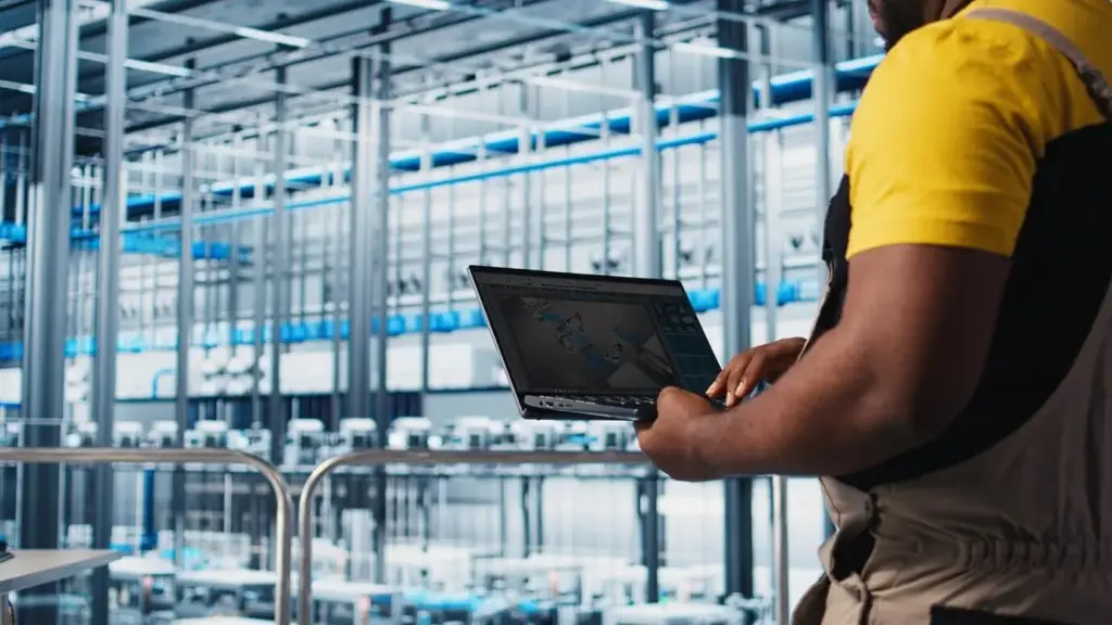
Forklift locations often begin as messy signals from RFID portals, UWB anchors, vision, and operator check-ins. Turning those fragments into dependable paths demands careful sampling strategies, drift correction, occlusion handling, calibration routines, and respectful privacy safeguards. When collection is disciplined and transparent, interactive visuals stop being guesses and become trustworthy motion stories that support layout planning, safety conversations, labor balancing, and throughput improvements that teams can believe, challenge, and continuously refine together.

Visual Languages That Reveal What Spreadsheets Hide

The right visual lets patterns self-introduce without needing paragraphs of explanation. For forklift movement and aisle congestion, heatmaps, vector fields, animated trails, Sankey flows, and occupancy timelines each answer different questions. We explore when to use them, how to avoid misreading density, and techniques to keep motion truthfully comparable over time.

Finding Congestion Before It Finds You

Aisle slowdowns accumulate quietly until they steal hours from picks and putaways. By measuring dwell distributions, queue lengths, headway variability, and occupancy thresholds, interactive visualization surfaces early signals that walkthroughs miss. Acting while patterns are still forming beats emergency reroutes, strained temp labor, and preventable near-incidents that nobody wants to file.

01

Bottleneck Signatures at Intersections

Fans of decelerations, stop clusters, and long headways radiating from a junction tell their own story. Compare flow balance by direction, fetch task mix, and parking behaviors near corners. Small nips—mirror placement, stop lines, turning pockets, or micro one-way rules—often deflate congestion without touching racks or shifting inventory.

02

Near-Miss Clues in Telemetry

Hard braking, abrupt swerves, horn bursts, and proximity alarms cluster where attention is already overloaded. Map these signals alongside congestion to prioritize fixes with safety upside. Encourage anonymous reporting and quick video snippets, then reconcile stories with data, building trust that visuals support people, not punish inevitable human moments.

03

Queue Dynamics and Service Rates

Multiple forklifts arriving to a single staging slot behave like a tiny queueing system. Track arrival variance, service time distribution, and blocking probabilities to locate under-served docks. Sometimes a modest buffer, visible countdown, or additional pallet jack shifts the curve enough to unlock smoother movement for the entire wave.

Dashboards People Actually Use

The best dashboard respects attention. Supervisors need fast, trustworthy cues for standups, while engineers need depth for root causes. Drivers benefit from timely nudges on rugged devices. We focus on clear goals, latency budgets, refresh rhythms, and cooperative annotations so visuals become shared tools rather than static status ornaments.

Stories from the Aisles

Data becomes wisdom through people. We share moments when drivers challenged assumptions, supervisors spotted oddities in seconds, and maintenance uncovered failing chargers through unexpected patterns. These narratives humanize interactive visualization, invite respectful debate, and encourage readers to contribute their own experiences for collective learning and safer, calmer warehouse days.

Experiment, Simulate, Improve

Before moving racks, test ideas in a safe sandbox. Use discrete event simulations, what-if heatmaps, and ghost trails to preview consequences. Sequence changes, measure before-after effects, and share results openly. We invite your questions, case studies, and bold experiments—subscribe and reply so the next iteration benefits everyone reading.
Swap aisle directions, test endcap openings, and add staging zones virtually. Compare predicted headways and dwell distributions against historical baselines. Involve operators early by reviewing simulated clips together, capturing feedback that improves both the model and trust, so implementation day feels like confirmation rather than a risky leap.
When two routing strategies both sound convincing, split shifts or zones and measure the difference. Track travel distance, stops per pallet, and congestion exposure per hour. Visualize comparative trails to reveal unexpected tradeoffs, then codify the winner in SOPs with a date, owner, and clear review cadence.
Fikovevonutuxomoxoni
Privacy Overview

This website uses cookies so that we can provide you with the best user experience possible. Cookie information is stored in your browser and performs functions such as recognising you when you return to our website and helping our team to understand which sections of the website you find most interesting and useful.