See Your Warehouse Breathe in Real Time

Today we dive into Real-Time Occupancy Heatmaps for Warehouse Utilization, showing how live spatial intelligence reveals where people, pallets, and equipment actually spend time. You will learn how to capture signals, turn them into meaningful color, and act decisively. Share your toughest aisle or staging area, and we will explore practical ways to visualize flow, reduce dwell, and deliver measurable throughput gains.

How the Signals Become Insight

Every dot of movement can tell a story when stitched together with context, time, and location fidelity. By layering sensor feeds, coordinate transforms, and robust calibration, you get a dynamic view of occupancy that respects privacy while exposing patterns. The result is a living map highlighting congestion, spare capacity, and unexpected behaviors that written SOPs rarely reveal, empowering proactive adjustments rather than after-the-fact reports.

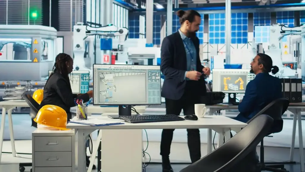
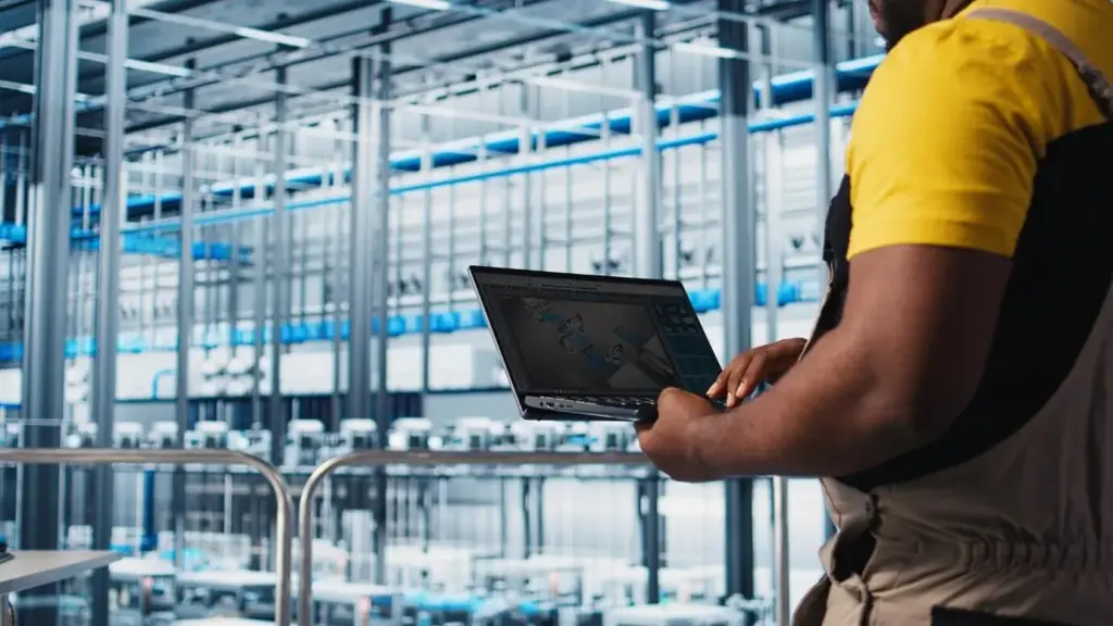
Sensing the Floor Without Slowing It Down

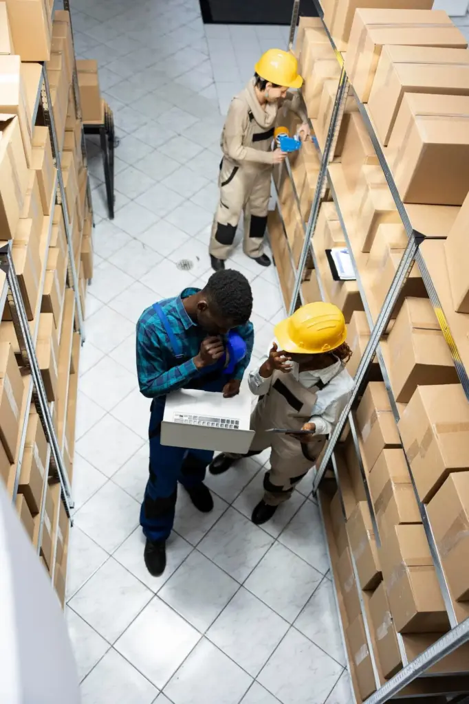
Choose minimally invasive data sources such as ceiling-mounted cameras with on-device anonymization, ultra-wideband tags on assets, passive RFID portals, or Wi‑Fi/BLE telemetry from handhelds and trucks. Combine these feeds to avoid blind spots, validate accuracy, and keep latency low. The operations team keeps moving, while the system learns quietly, turning ordinary activity into rich insight and actionable, timely visibility across zones and shifts.

Transforming Coordinates into Meaningful Color

Raw positions become occupancy by projecting them onto a grid aligned with racks, aisles, and staging areas. Temporal windows aggregate presence, while smoothing reduces flicker from noisy signals. Colors encode intensity, but annotations add context: pick-paths, dock doors, safety lines, and no-go zones. The map stops being a pretty picture and becomes a shared language for decisions, planning, and everyday floor conversations that drive improvements.

Peak Hours You Can Act On

Heatmaps expose rush periods at docks, value-add stations, and high-velocity pick faces. Instead of generic staffing rules, you align people to the real curve of arrivals and picks. Notifications point supervisors to brewing congestion, not yesterday’s headaches. The shift lead becomes a conductor, balancing flow with timely interventions that prevent queues from forming, preserve safety margins, and keep carriers on schedule without frantic last-minute scrambles.

Smarter Slotting That Reduces Travel

By tracing actual footsteps and truck routes, you see which items trigger detours, dead-ends, or awkward cross-traffic. Re-slotting based on observed co-picks and dwell patterns trims walking distance and accelerates batch picking. Seasonal changes are validated with A/B layouts, not hunches. The map reveals golden zones that deserve premium items, and underused corners that can host slow-movers, balancing density with safety and ergonomic best practices.

Right-Size Labor and Equipment

When occupancy spikes, supervisors often add people or forklifts reflexively. Granular utilization shows whether the real constraint is staging space, staging discipline, or a single pinch point like a narrow aisle. This clarity prevents overstaffing and focuses investments where they matter most. Fleet size, shift overlap, and cross-training plans become data-backed, improving service levels and margins while protecting teams from burnout and unproductive hustle during peak waves.

A Practical Path from Pilot to Scale

Momentum starts with a high-impact area, clear success criteria, and visible wins for operators. A focused pilot builds trust, uncovers integration needs, and refines alert thresholds. From there, a phased rollout prioritizes zones with the most variability or volume. Throughout, change management is paramount: involve associates early, communicate goals, and celebrate improvements. Sustainable adoption grows when people feel respected, heard, and equipped with better tools.

Metrics That Matter

Clarity begins with definitions everyone accepts. Occupancy without context can mislead, so pair it with throughput, dwell, and staffing levels. Visual KPIs should guide action, not decorate screens. Trend lines, percentiles, and variability expose reliability, while control limits prevent overreacting to noise. With a consistent scorecard, supervisors, engineers, and finance speak the same language, speeding alignment and making experiments easier to justify and evaluate credibly.

Designing Visuals That Drive Action

A useful display respects human perception, accessibility, and the messy realities of a warehouse. Colors must communicate urgency without shouting constantly. Overlays should explain, not obscure. Interactions need to be quick for supervisors on the move. The best designs help a tired lead make one right decision at the right moment, turning attention into results without demanding constant, exhausting screen time or distracting theatrics that mask real issues.

Trust, Safety, and Governance

Operational intelligence must respect people, regulations, and long-term stewardship of data. Start with privacy-by-design, explain intentions plainly, and invite feedback early. Establish retention, ownership, and access rules before scale. Align with safety committees and joint leadership councils. When governance is visible and consistent, operators view the system as a partner, not a watchdog, and leaders gain durable confidence to invest further without fearing reputational or compliance surprises.
Fikovevonutuxomoxoni
Privacy Overview

This website uses cookies so that we can provide you with the best user experience possible. Cookie information is stored in your browser and performs functions such as recognising you when you return to our website and helping our team to understand which sections of the website you find most interesting and useful.